Helping others achieve their goals has always given me a sense of accomplishment and provided sincere meaning for my work. When the founder of Booking It shared her dream for the brand, I felt an immediate connection to the mission. As the husband of an avid reader, I recognized that partnering with someone who shared that same passion wasn’t just another project; it was a chance to be a part of something that truly matters to my family and the community.
The purpose of the Booking It brand is clear and simple: to serve school-aged children and foster a lifelong love of literature. Powered by the dedication of donors and volunteers, the organization puts books directly into the hands of local youth, supporting community literacy one story at a time.
Before beginning the concepting phase, I collaborated with the founder and board members to define the brand’s target demographic: Pre-K through 12th grade. This wide range presented the unique challenge of creating a visual identity approachable enough for young children, ‘cool’ enough for teenagers, and professional enough to engage potential donors and volunteers. Additionally, we needed to ensure the brand stood out from similar organizations in both the local and national literacy space.
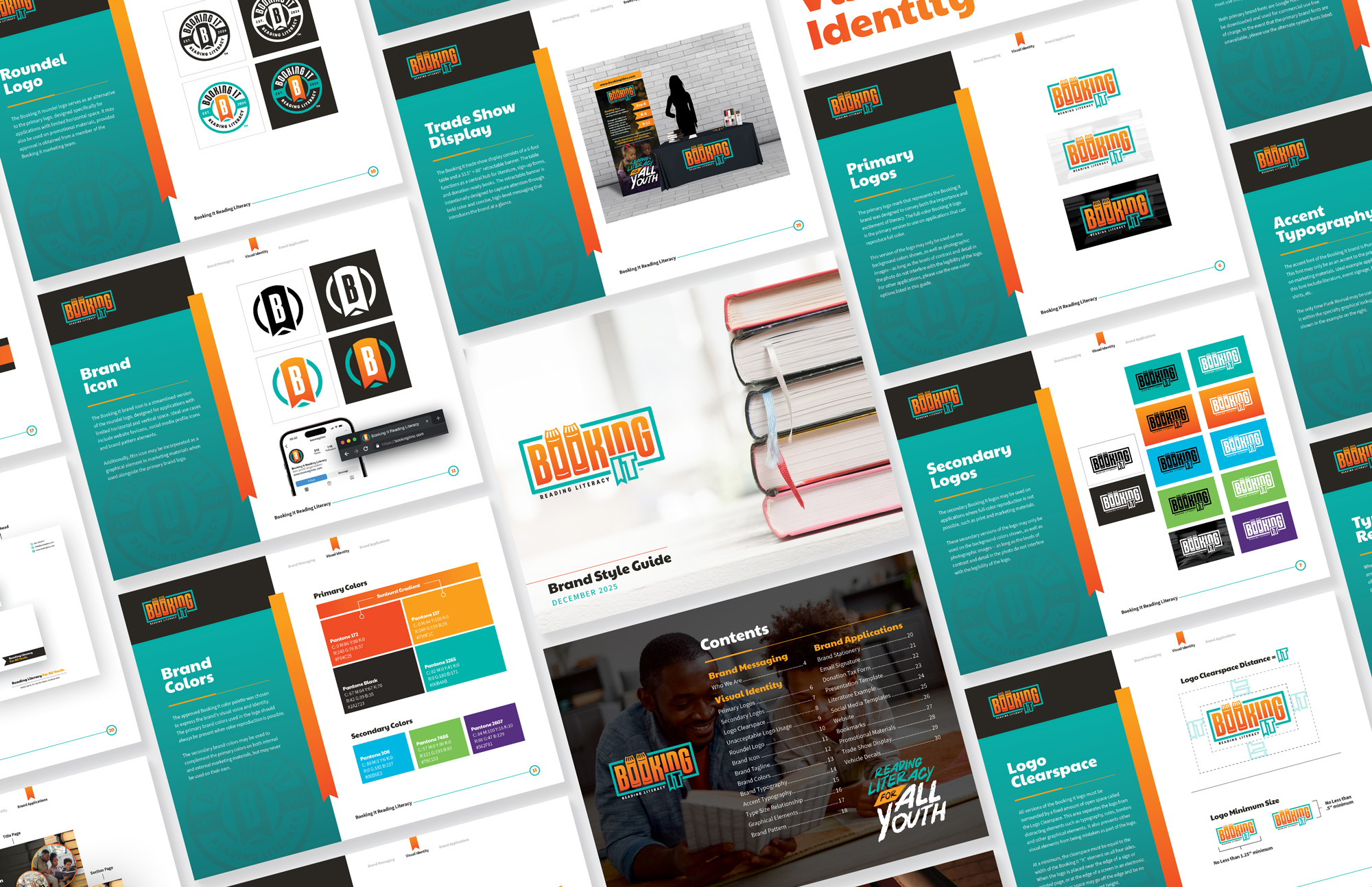
The design phase began with detailed research into the specific colors, typography, and iconography that would resonate with our broad target audience. Once a clear direction was established, I transitioned into sketching and concepting, exploring various motifs centered on literacy and book imagery. The goal was to create an identity that was both instantly identifiable and a direct reflection of the brand’s mission. The final chosen mark is intentionally simple, featuring subtle yet clear nods to the organization’s core work. To complete the identity, I developed a confident and vibrant color palette designed to appeal across the entire Pre-K to 12th-grade demographic.
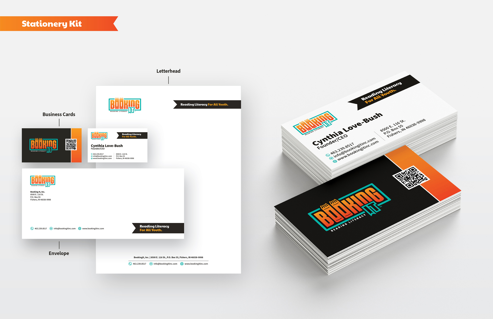
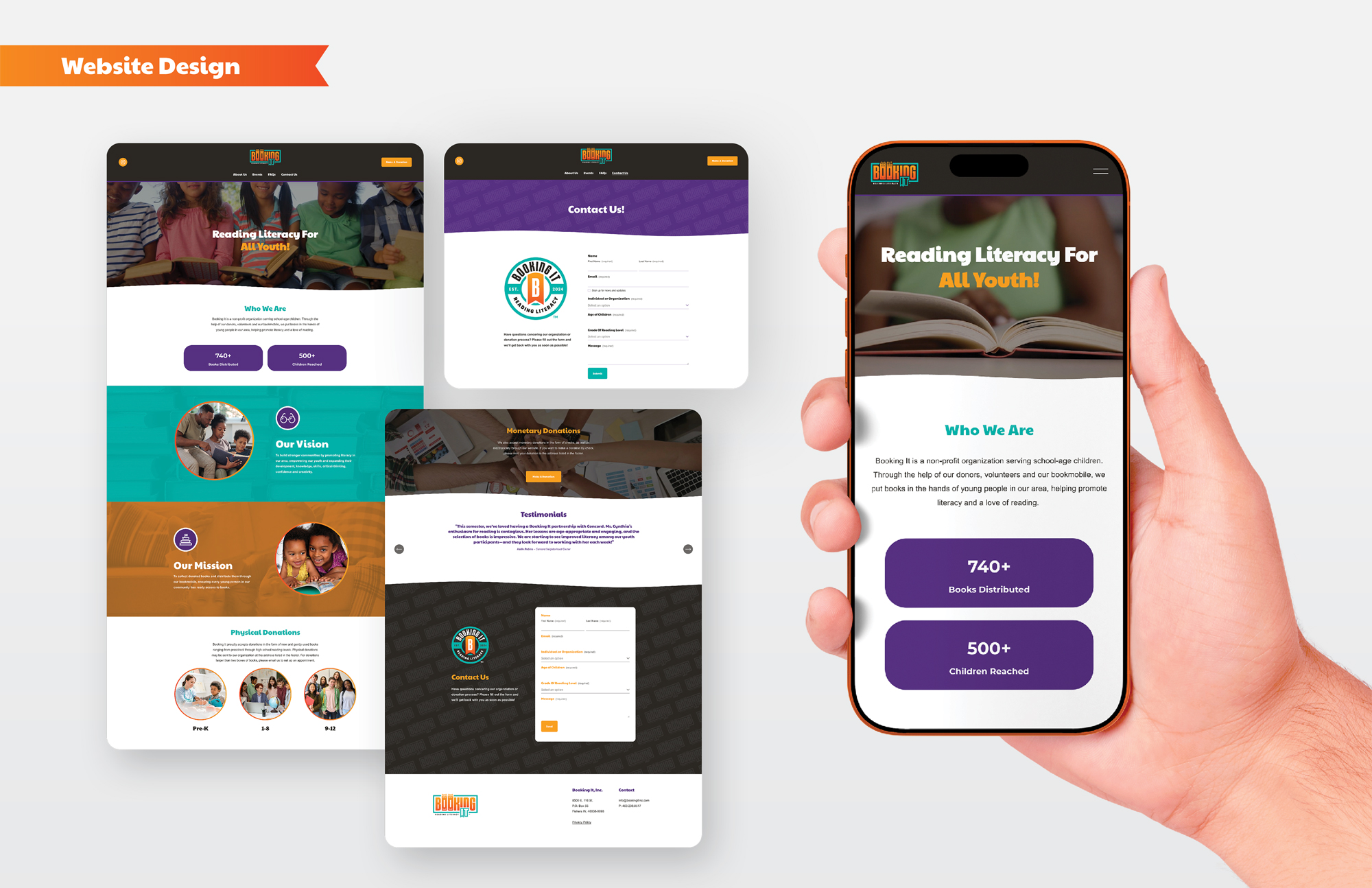
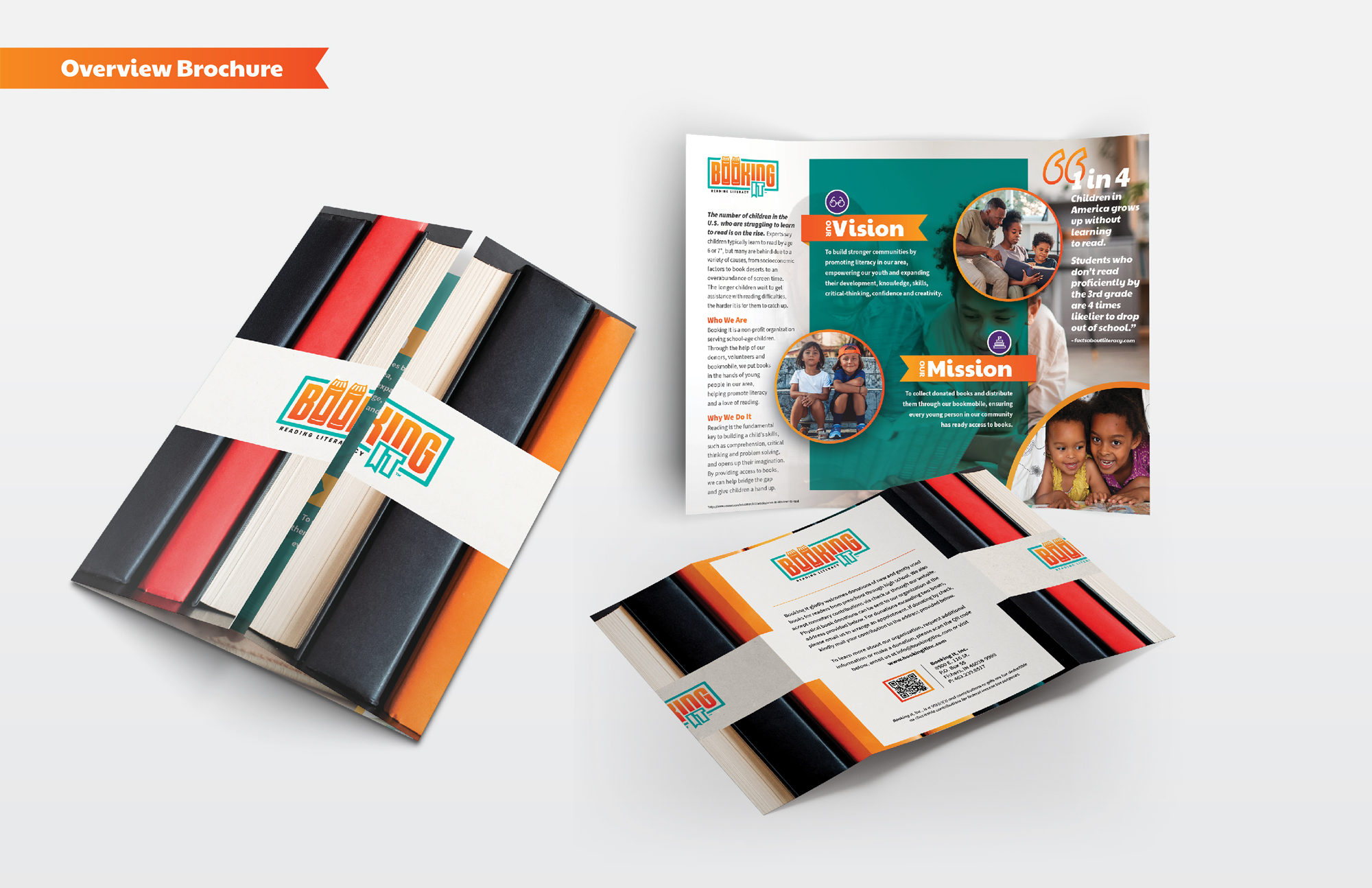
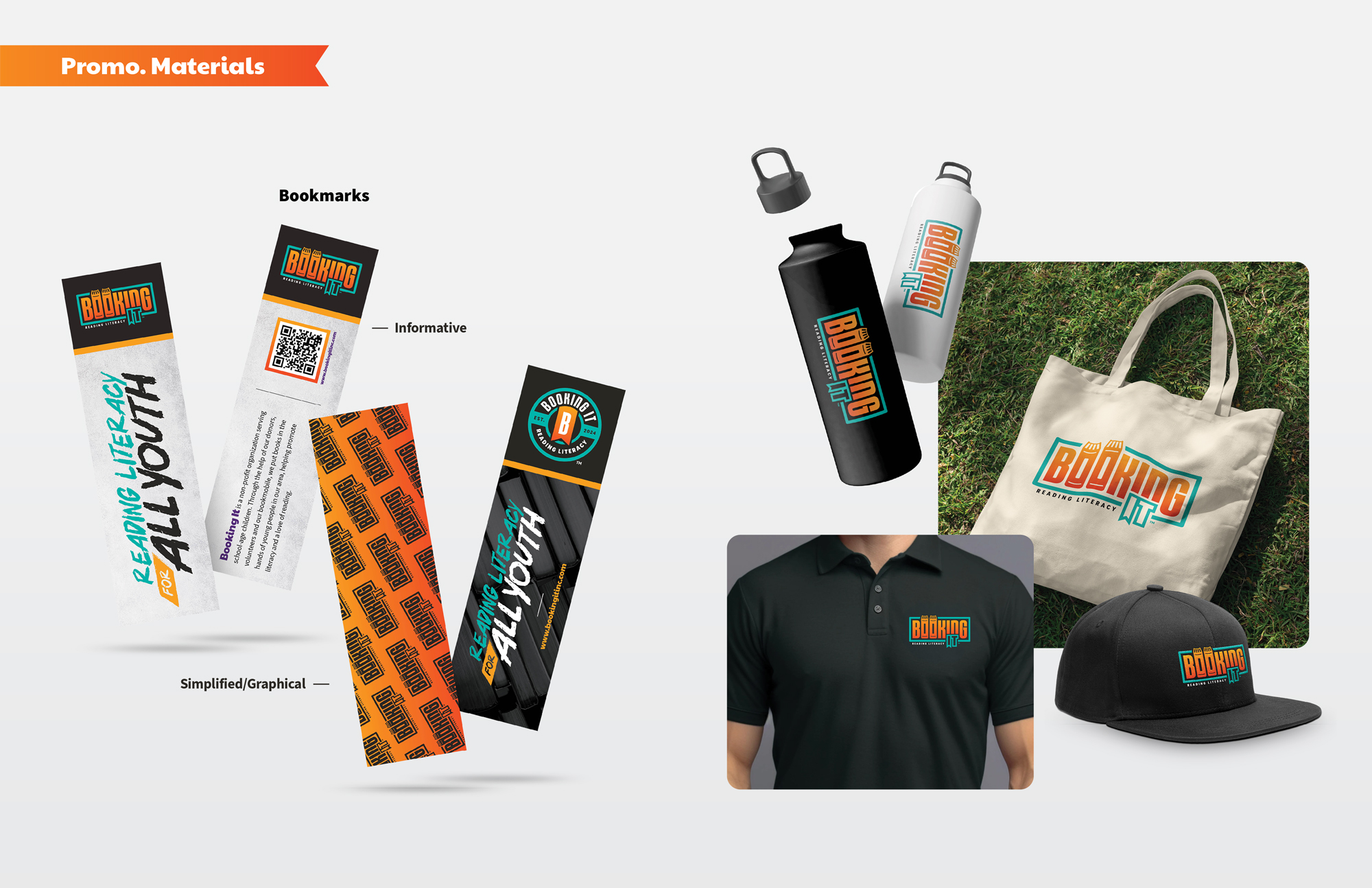
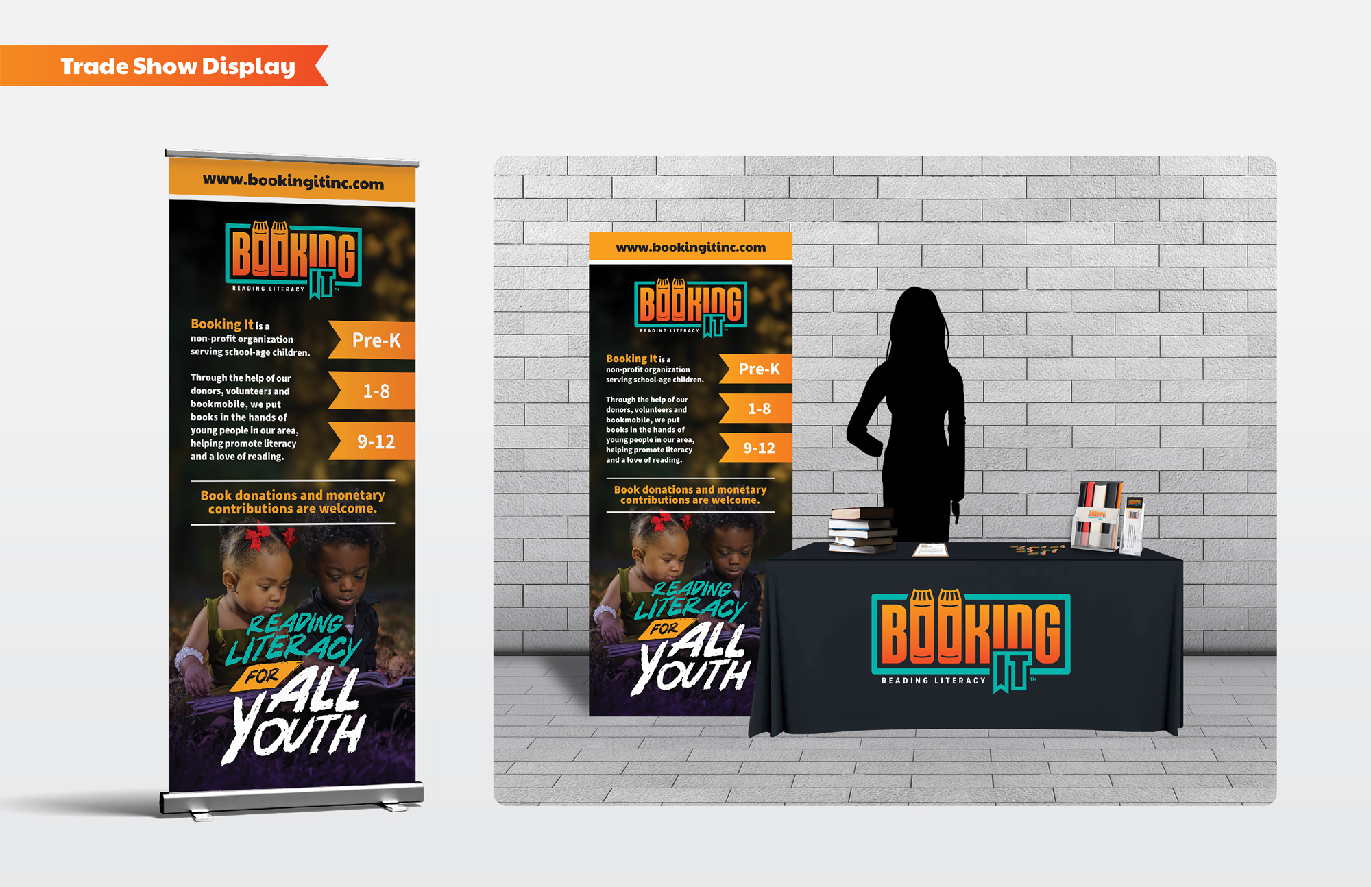
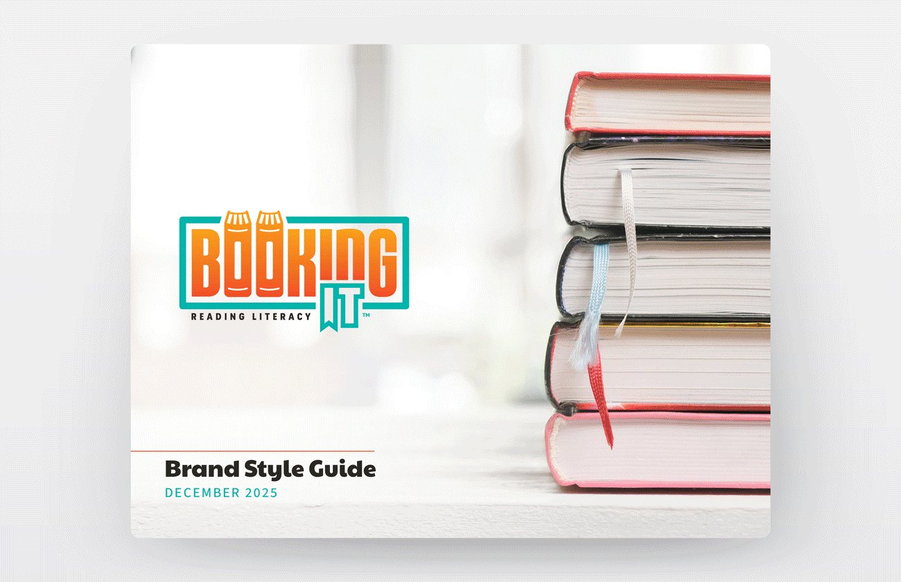
Following the logo design, I developed a detailed set of brand guidelines to ensure the visual integrity of Booking It remains consistent across all public-facing collateral. The guide establishes clear standards for logo usage, typography, color, and supporting graphical elements. To demonstrate the system’s versatility, the guidelines also feature various marketing assets including stationery, brochures, tradeshow displays, and the website. These examples serve as a blueprint for replicating the brand identity to maintain visual consistency.
Within its first year of launch, the Booking It brand distributed over 845 books and reached nearly 550 children. In its base city of Indianapolis, local organizations such as community centers and YMCA branches host weekly events where donors can contribute books for distribution. The success of these initiatives demonstrates the brand’s ability to engage the community and fulfill its mission of fostering literacy for the next generation.
 Brand guidelines
 Brand guidelines